Choosing the right colors for your home can feel overwhelming, especially with so many options out there. It’s easy to make mistakes that can throw off the balance and vibe of your spaces. By recognizing and correcting these common color missteps, you can transform your rooms into more cohesive and inviting areas.
In this article, you’ll discover the color mistakes I used to make that resulted in unbalanced and chaotic spaces. You’ll find practical tips that can enhance your understanding of color application in your home. Making these adjustments can lead to a refreshing change, giving your rooms a newfound sense of harmony and style.
Advertisement
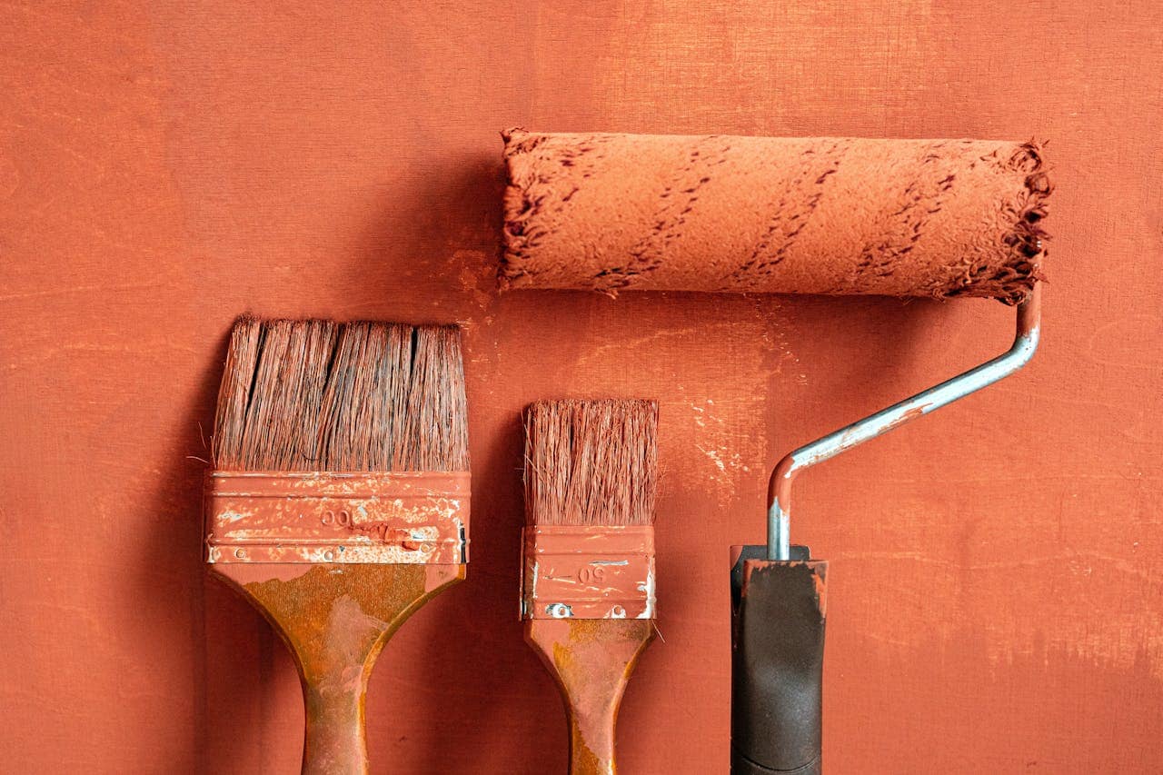
Choosing the wrong neutral base
The choice of a neutral base can truly affect how your space feels. Opting for a trendy neutral that doesn’t match your furnishings can create a disjointed look.
Instead, aim for neutrals that complement your existing colors and textures. This helps create a more cohesive and inviting atmosphere in your rooms.
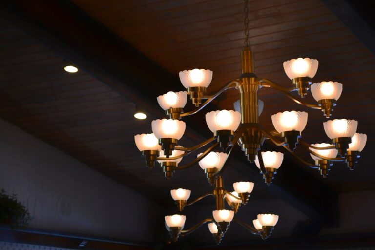
Overwhelming Statement Pieces with Colors
Choosing statement pieces in bold colors can be tricky. If you go too far, they can dominate the room and clash with other elements.
Instead, consider balancing these vibrant pieces with neutral tones or softer shades. This way, your statement piece shines without overwhelming your space.
Using too many bright colors together
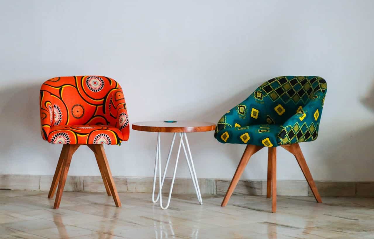
Mixing too many bright colors can overwhelm a space. It might feel chaotic rather than cohesive. Instead, pick a few bold colors and balance them with neutrals. This way, your room can pop without being visually exhausting.
Remember, less can be more when it comes to color. Find harmony by allowing some colors to stand out while others support.
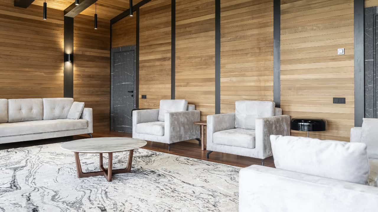
Forgetting to Balance Warm and Cool Tones
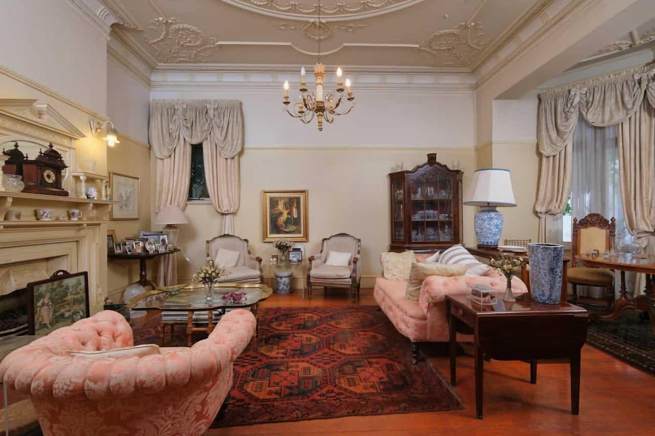
When decorating, it’s easy to forget about balancing warm and cool tones. Too many cool colors can make a space feel uninviting, while an overload of warm hues might feel overwhelming.
Try mixing both tones to create a more harmonious feel. Use warm accents like throw pillows or artwork to soften cooler base colors. This balance adds depth and comfort to your rooms.
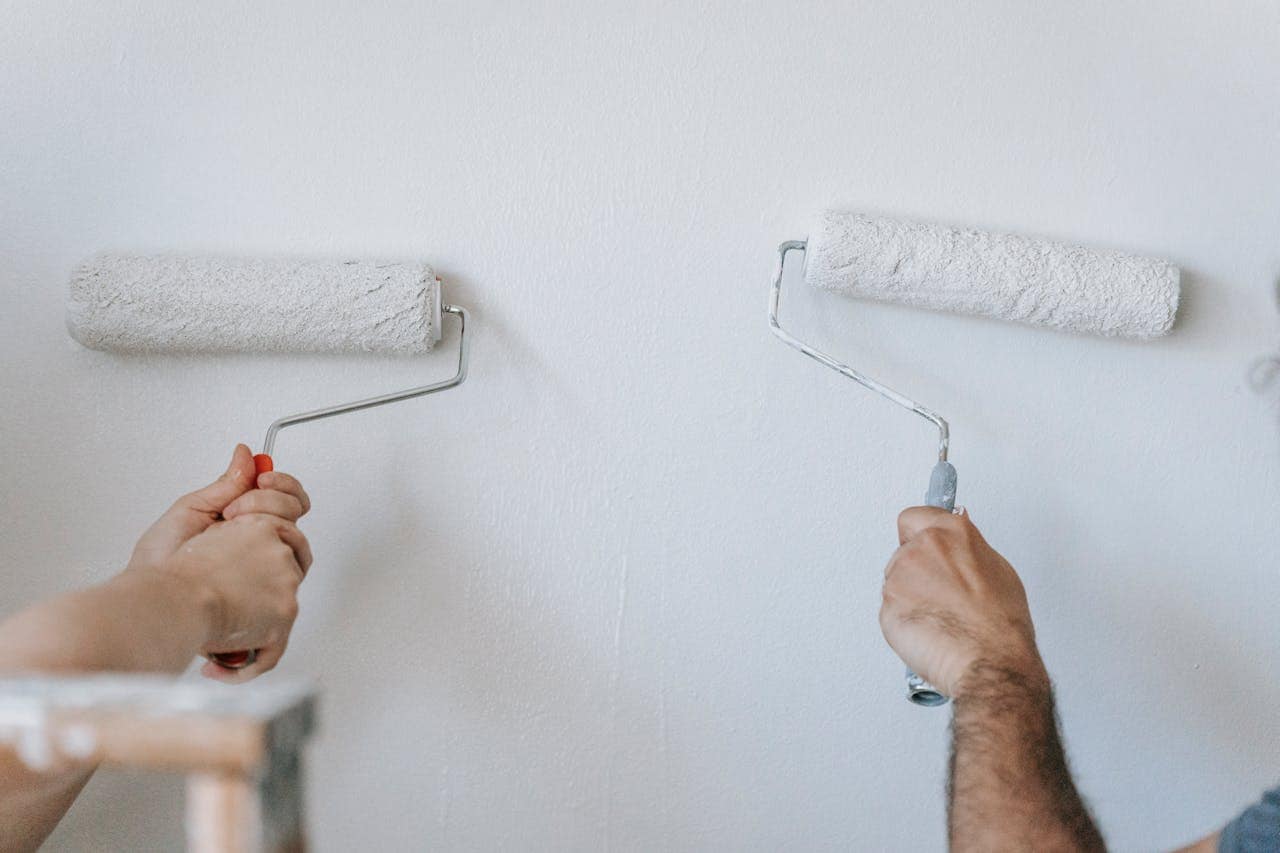
Not sampling color in different lights
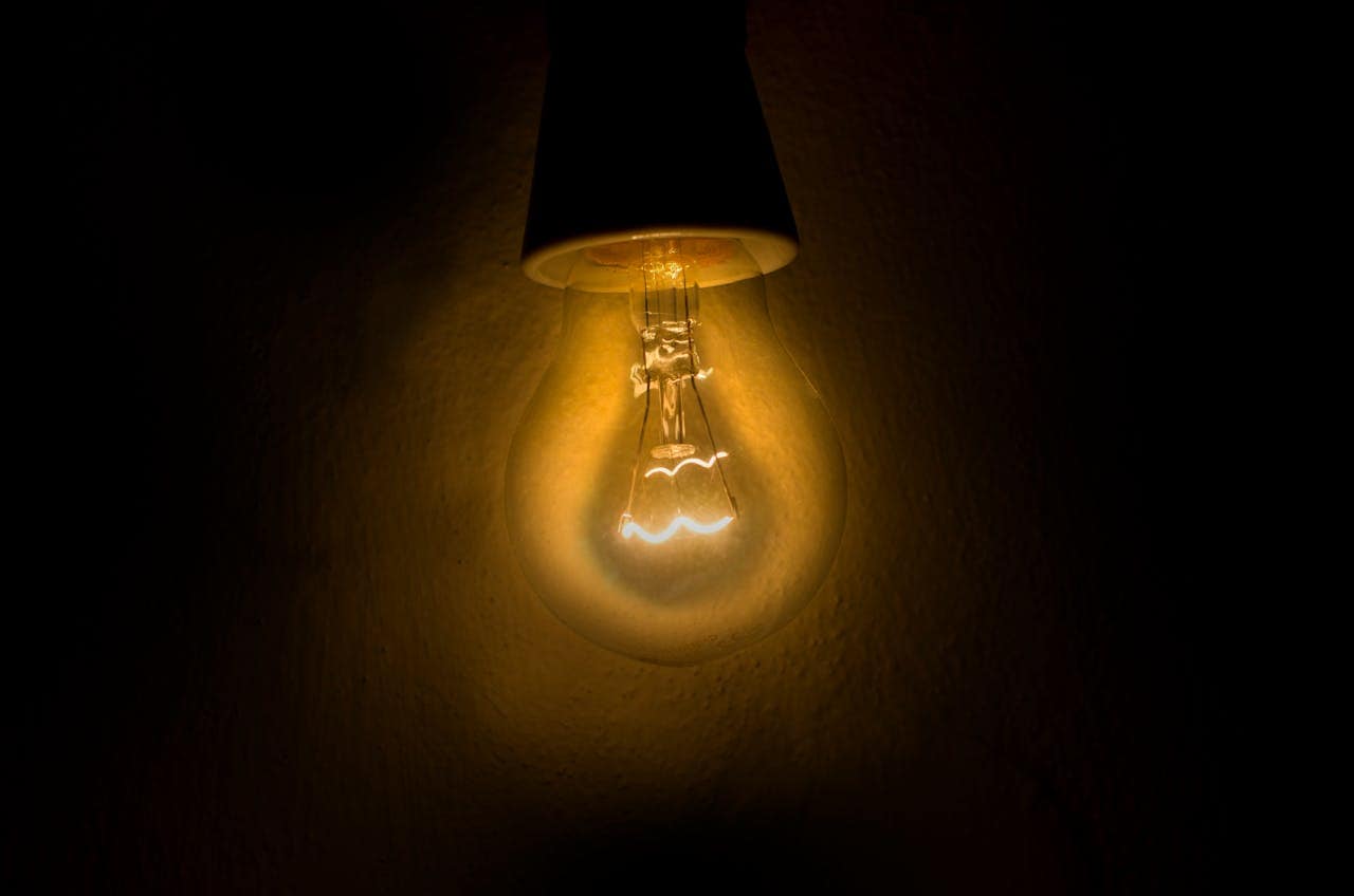
One of the biggest mistakes you can make is not seeing how colors change in different lighting. Colors can look totally different in the morning sun versus dim evening light.
Before committing, test your shades in various conditions. Paint swatches on the wall and observe how they shift throughout the day. This simple step can save you from a color regret later.
Decorating around paint instead of furniture
When choosing colors, it’s easy to let the paint dictate your choices. Instead, think about the furniture you love and use that as your starting point.
By prioritizing your furniture, you’ll create a more cohesive and inviting space. Choose a color that complements your pieces rather than forcing your furniture to fit around a paint color.
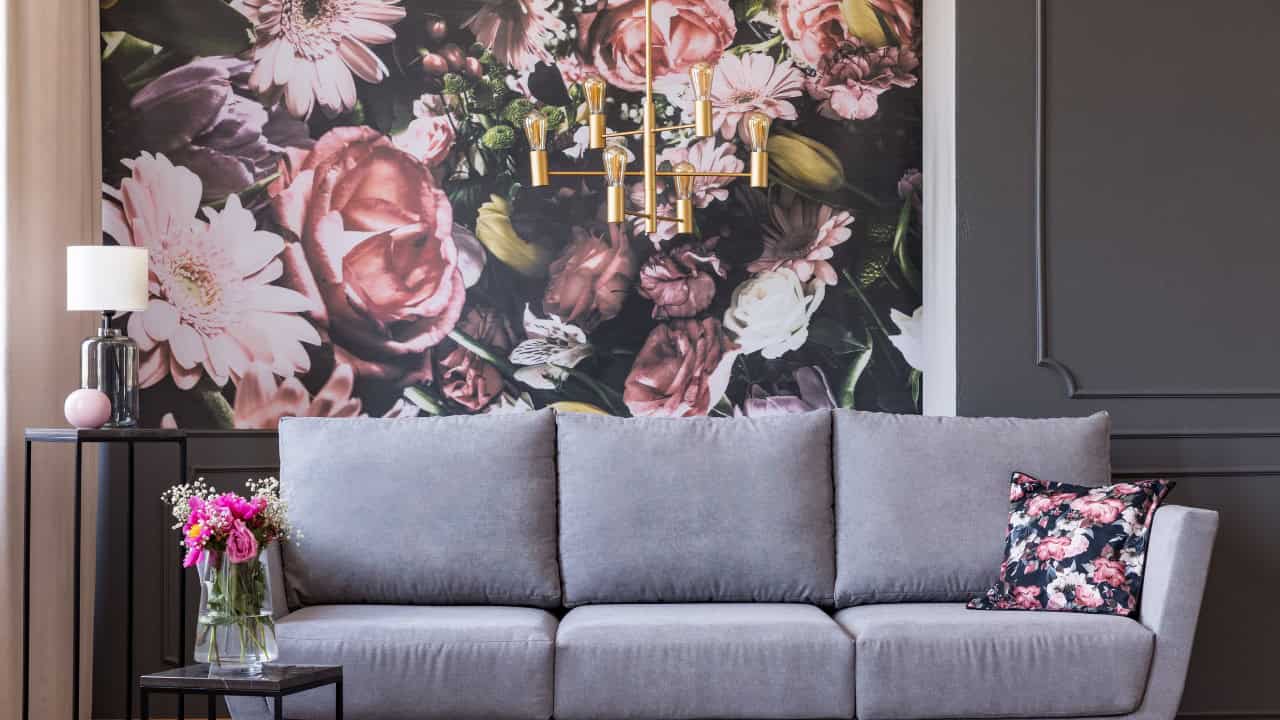
Ignoring Contrasting Colors for Depth

Not using contrasting colors can flatten your space. When you ignore this, rooms may look dull. Incorporating shades that pop against one another creates visual interest.
Think about how deep hues can enhance lighter tones. They don’t have to clash; they can complement beautifully and add dimension to your decor.
Mixing Clashing Undertones
Mixing clashing undertones can throw off the vibe of your room. When choosing colors, pay attention to undertones like warm and cool shades.
For example, pairing a warm beige with a cool gray can lead to awkward contrasts. Instead, aim for colors that complement each other, ensuring a more harmonious look.
Not incorporating accent colors

If you stick to just one or two colors, your rooms might feel flat. Adding accent colors can really bring life to your space. They create visual interest and can highlight furniture or decor pieces you love.
Think about using throw pillows, artwork, or a rug with a pop of color. It’s a simple way to make your room feel more balanced and inviting.
Getting too matchy-matchy with the palette
When you stick to a color palette that’s too uniform, your space can end up feeling flat. A little variety brings in interest and depth.
Consider adding different shades or complementary colors to create contrast. This can make your rooms feel more vibrant and inviting. Don’t shy away from mixing textures and patterns as well!